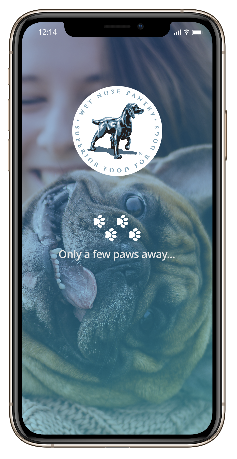
Lovin' Bowl
Superior Food For Dogs.
THE CONTEXT :
Lovin' Bowl specializes in providing top quality organic food for dogs. The company prides itself in providing not only a great product but also a great customer experience.
The client requested a web presence that it's both elegant and playful while providing all the information that the audience might need. Several user studies, user flows and wireframes were developed for both the site and a mobile application.
- ClientLovin' Bowl
- IndustryPet Industry / Product
- My RoleUX & UI Complete Design
- Websitewww.lovinbowl.com
- the challenges
- ● Improving the purchasing experience.
- ● Increase returning customers.
- ● Designing purchase automation solution in Application.
- ● Creating a personalized experience.
- ● Providing all desired content without overwhelming the user.
- ● Blending modern and contemporary design.
- the strategy
- ● Design & market research - interviews and surveys.
- ● Develop personas based on data acquired.
- ● Create user flows and interactive prototypes.
- ● Provide a scalable shopping cart functionality for site.
- ● Create feature in App that promotes purchase automation.
- ● Incorporate Social Media engagement within site.
- ● Heuristic evaluation on interactive prototype.
- ● Conduct usability and impression testing.
- the tools

GOT TO KNOW
THE USER
Was I asking the user the right quetions?, what challenges do they face?, how will they use the product?
- Who they were, their main goals with the product and how they were going to use it
- Desired user functionality for cart-implementation and pain points
- Organic pet food industry market-share
- Average target age & demographic
- Current industry trends and top competitors
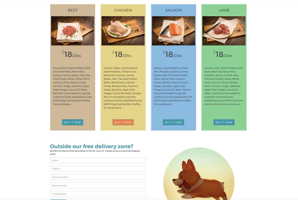
- 95% of dog owners who purchase organic food like to see images of the actual ingredients, no stock photography.
- 90% of the users prefer a personal experience that connects them to the brand with tailored content while using the app.
- 82% of users prefer a shopping cart option in which they can create an account and store payment info for future purchases.
- 64% of the customers like to check reviews before making a purchase.
- 73% of the clients are concerned with being able to provide their dogs with flavor variety.
- 89% of the users don't like to be constantly contacted via email for marketing purposes.
- Creating a layout that distributes the information evenly with a priority on imagery.
- Incorporating modules dedicated to bold images of the product's ingredients.
- Creating an user interface with custom icons and content to promote a personalized experience.
- Designing an automated purchasing solution that will help with user satisfaction and retention.
- Formulating a design solution to provide the user with more payment options.
- Coming up with a design solution that allowed the owners to provide their pets with flavor variety.
MEET THE
PERSONAS
Based on the data that I gathered by doing design research ( mainly primary ), I was able to determine who the users are as well as the problems that they face when interacting with this kind of product.
I came up with three personas that I believe represent the range of behavior of pet owners as a whole. These are the main points of description for each persona:
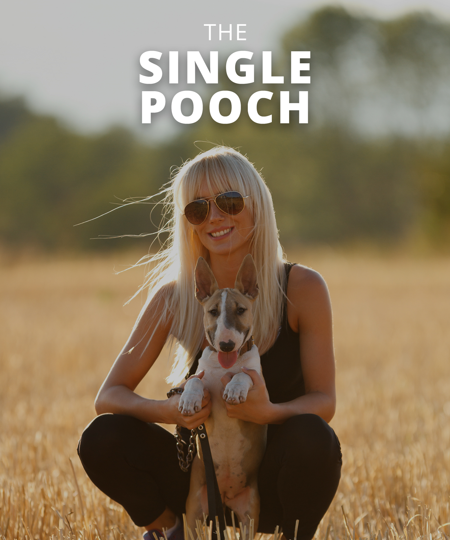
RACHEL
18–35 years old
Rachel loves her furry companion while she studies and every day when she winds down after work or school. She sometimes struggles remembering to walk her dog or to go to the pet store for supplies.
- Needs a way to remember going to the store.
- Wishes to limit her trips to buy food.
- Prefers alternate payment methods (PayPal).
- Doesn't like to get reminders through emails.
- Limited payment options with credit cards.
- Being redirected when tracking orders.
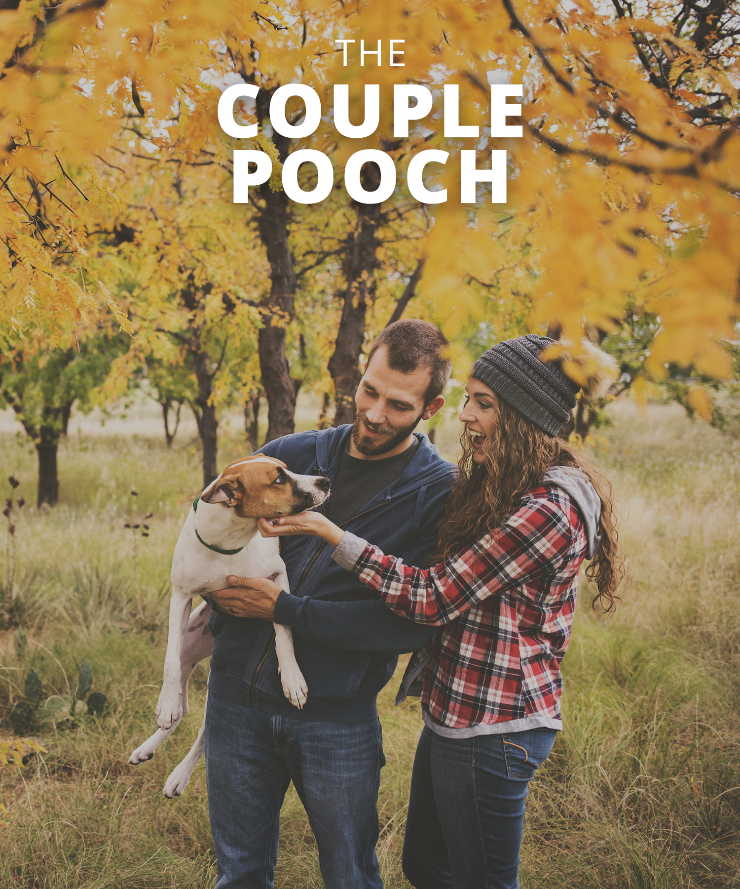
DOUG
23–40 years old
Doug and his partner always make sure to get only the best for their dog. They usually prefer organic food and wish that their pet was treated like a customer with a more personalized touch.
- Wants to know the food ingredients clearly.
- Prefer a personalized service.
- Likes to see product reviews.
- Dislikes stock images for ingredients.
- Not being able to see reviews.
- Missing a way to ask questions from the app.
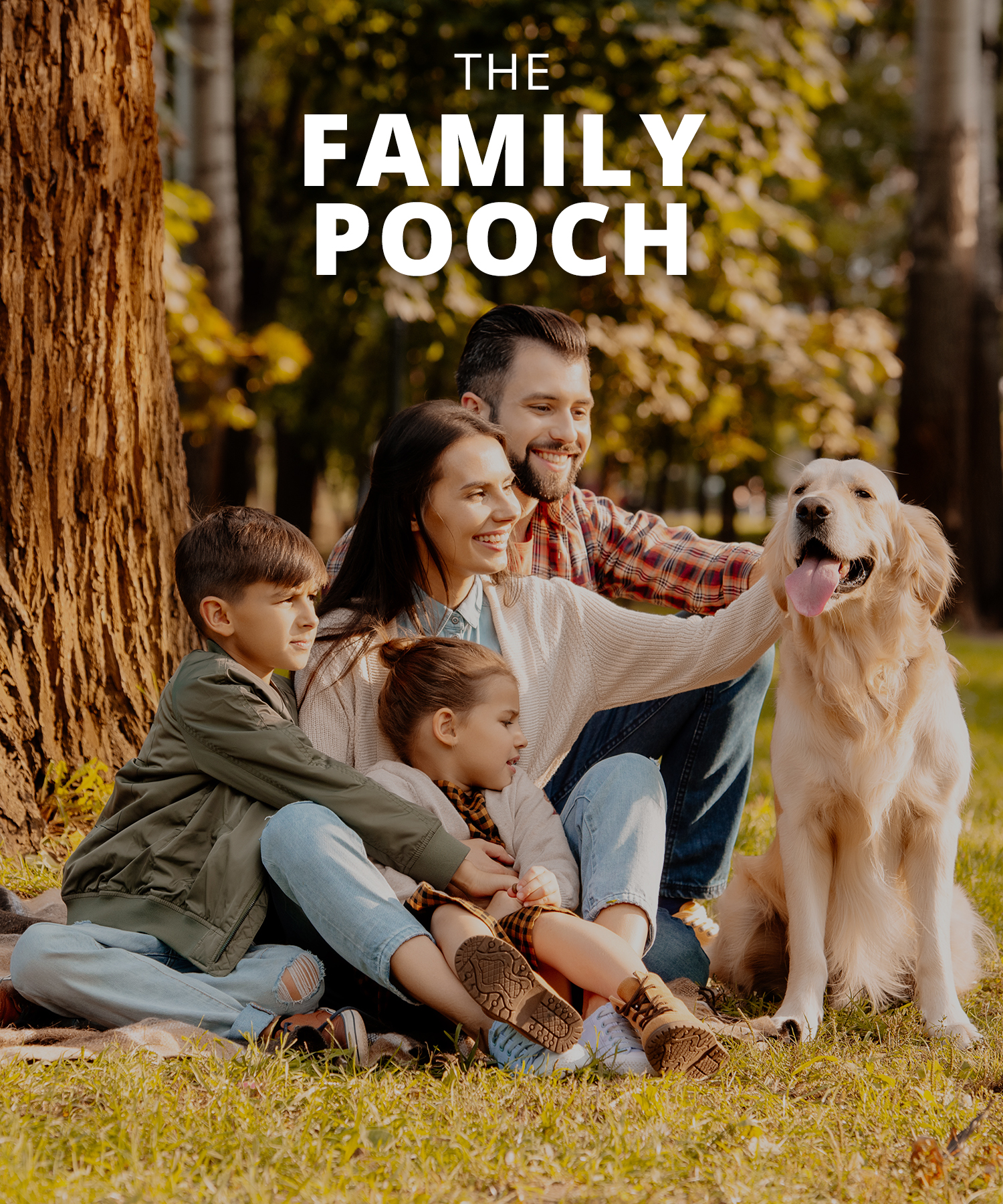
CLAIRE
30–51 years old
Claire and her family really enjoy playing with their dog. She wishes that she could offer her pet the option of different flavors while not having to worry about remembering to place an order every month.
- Would love variety for their pet.
- Needs an automated option.
- Hopes for a way to track online orders.
- Not being able to customize delivery.
- When clear pricing is not displayed.
- Limited shipping options.
THE
BONES
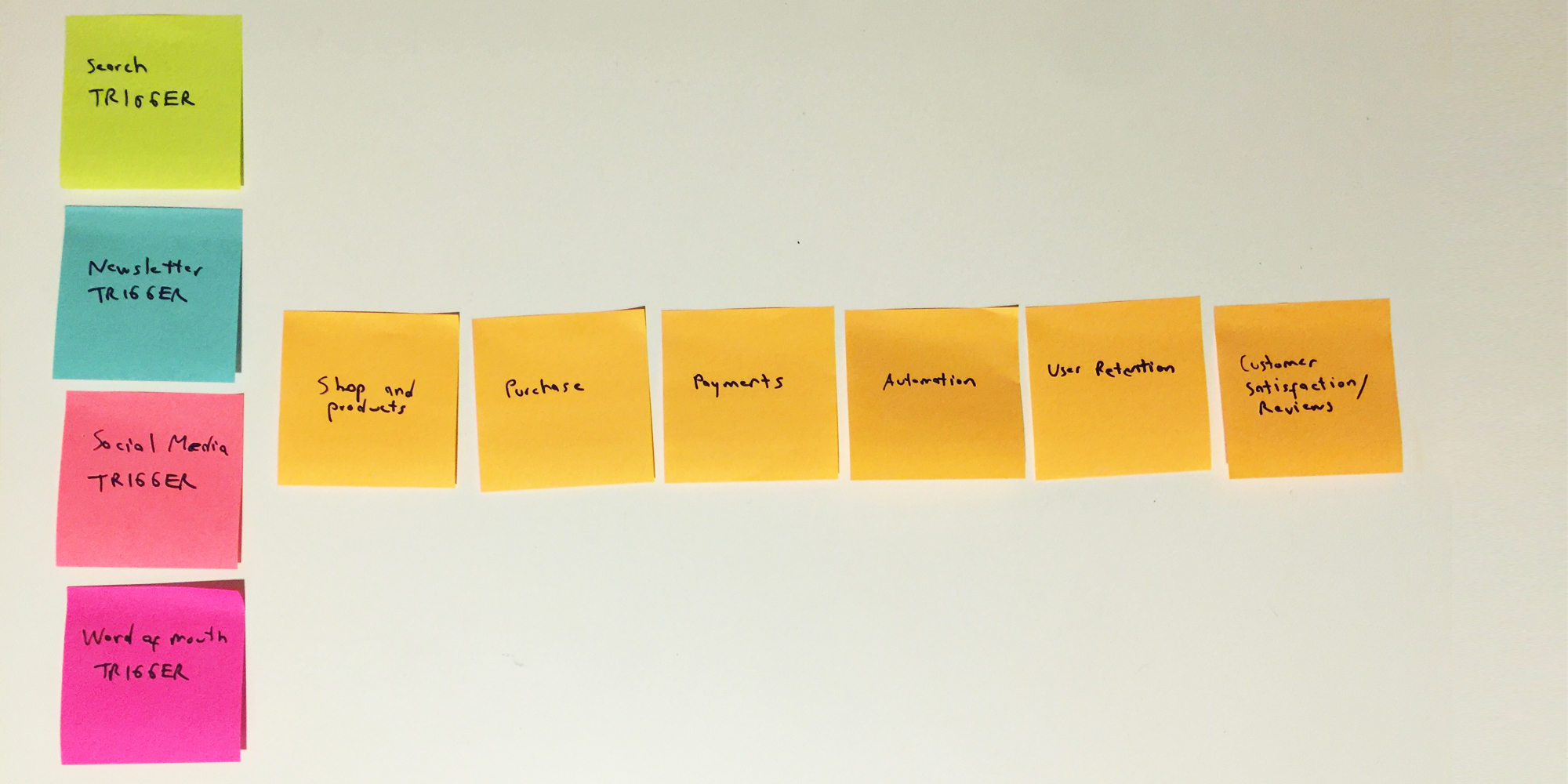
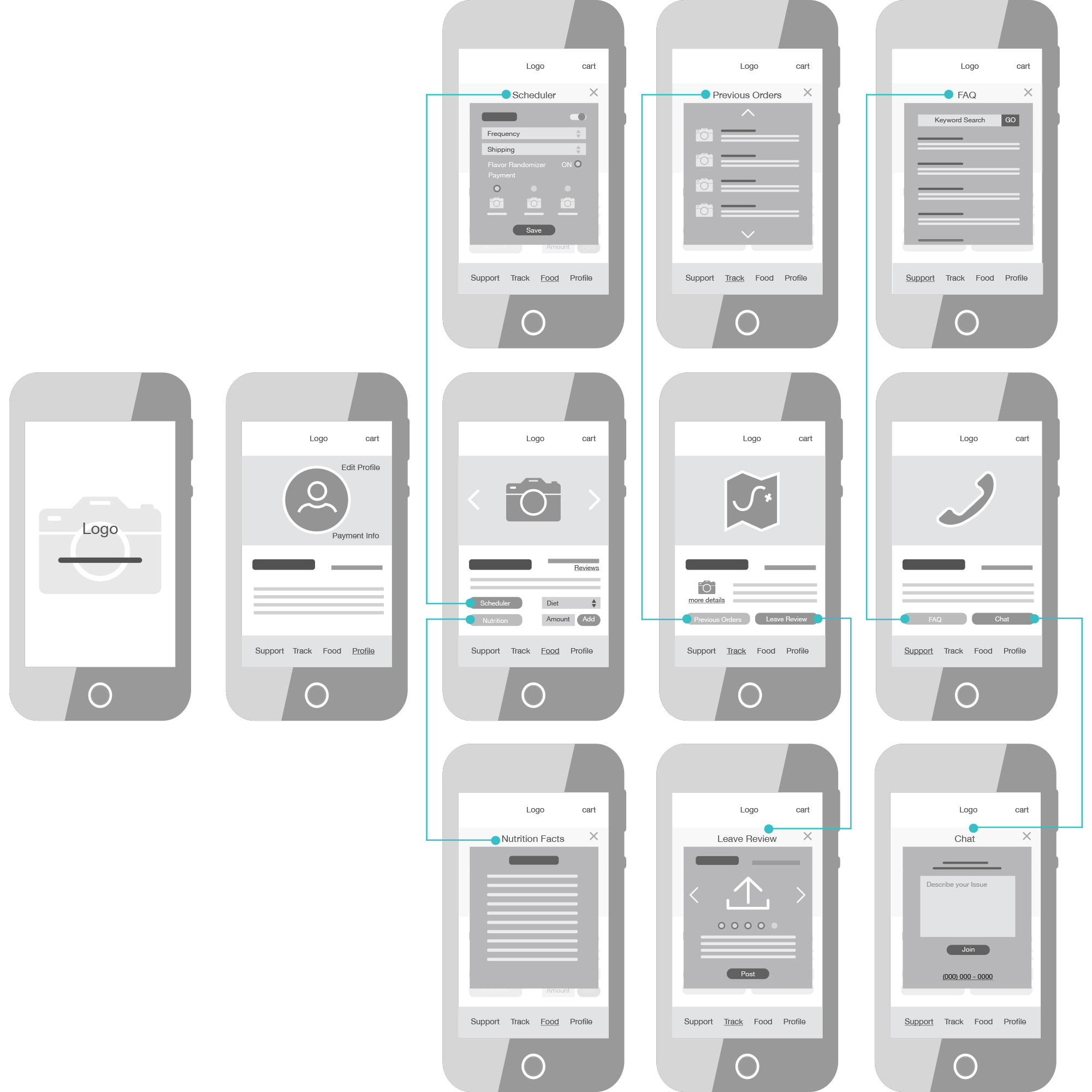
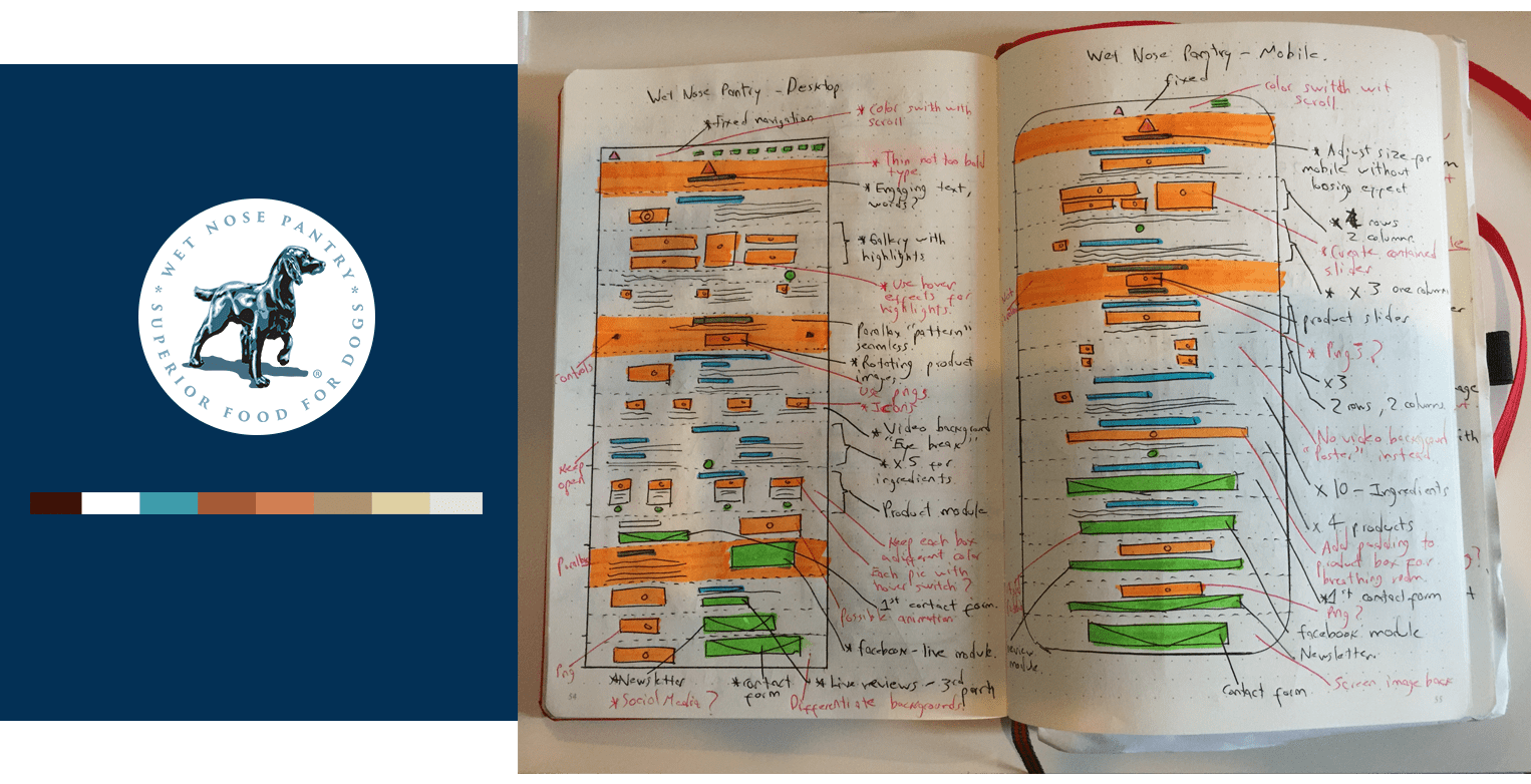
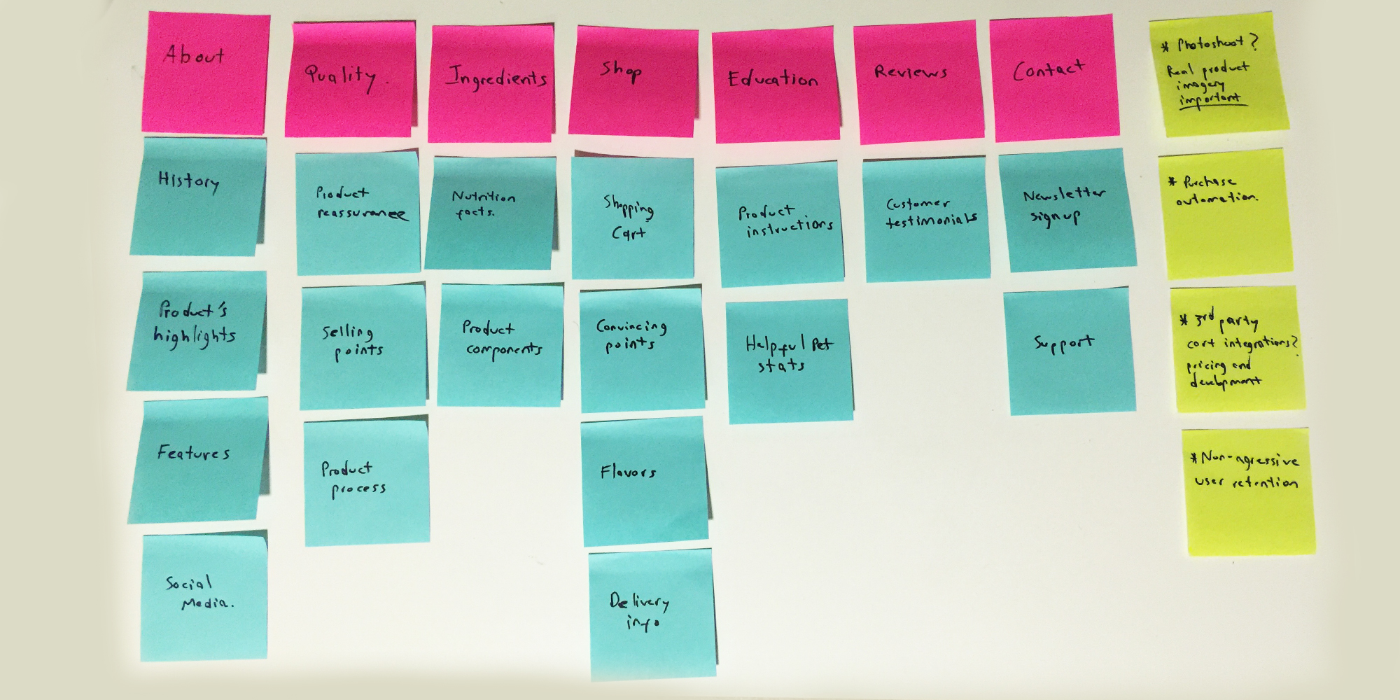
After performing a series of user studies with both a survey and interviews, I was able to formulate a basic idea of the user journey with sticky notes. I came up with a simple and effective experience that could solve all the pain points while delivering the desired functionality.
These are some of my initial studies ( please keep in mind that these are a only a part of the complete set of low fidelity wireframes and any additional ones can be delivered upon request ):
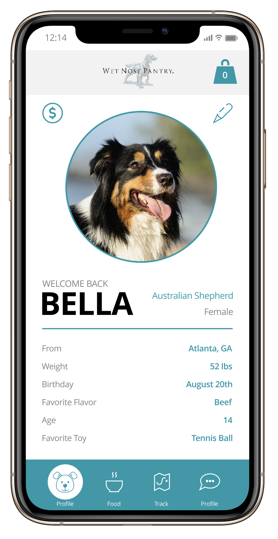
Personalization - Solution
By targeting the pet as the customer through the profile customization, the positive user feedback increased substantially since the client felt a deeper connection with the brand.
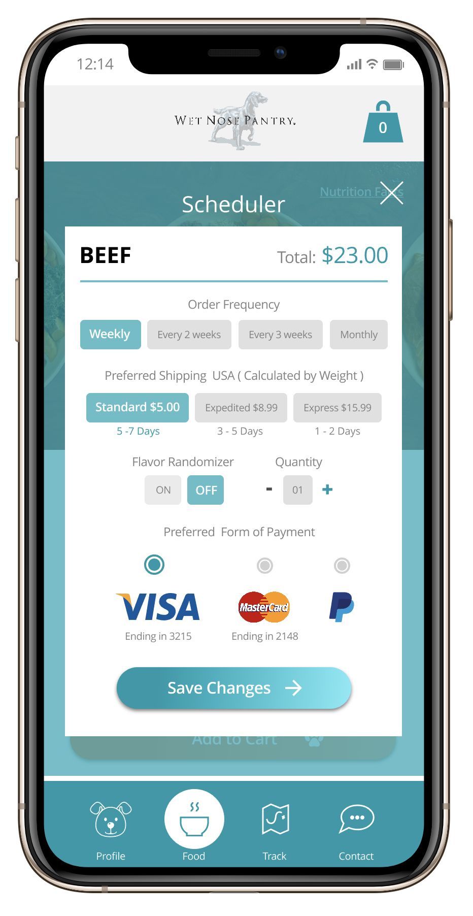
Scheduling Feature - Solution
By creating this feature, the 2 main pain points were addresed. The user no longer has to remember to order the product and variety is offered through a simple toggle.
Nutrition Info - Solution
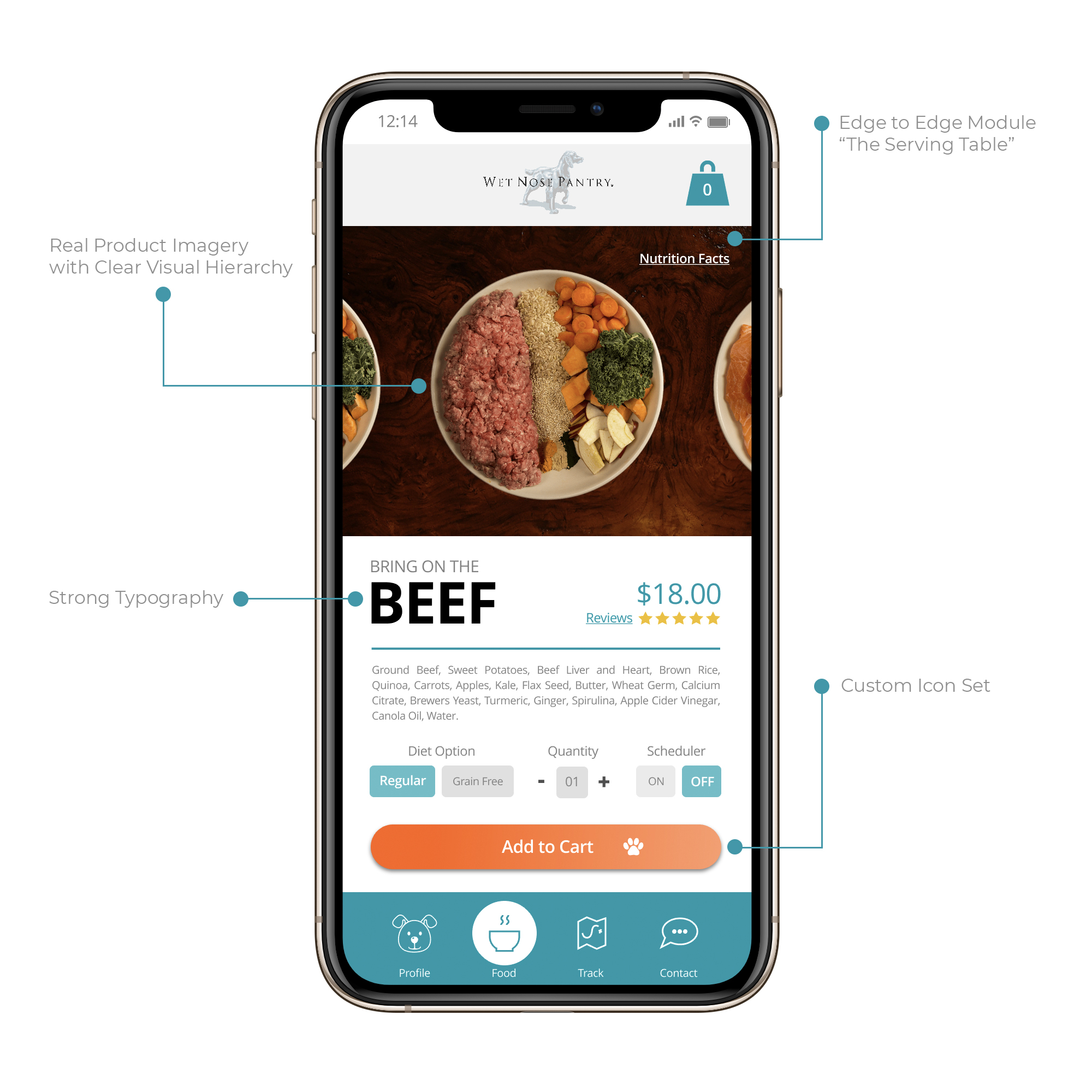
By providing real product imagery and nutritional info, the user has access to an important selling point within the experience. This proved to be very effective during usability testing.
THE
MEAT
I knew that it was crucial to create a personal onboarding experience through the right design language so I decided to develop a custom pattern library and interface without deviating from user familiarity.
I wanted to promote the brand's friendly voice and tone with a soft color scheme, custom iconography and a visual hierarchy that emphasized imagery.
Here are some samples from that step of the process:
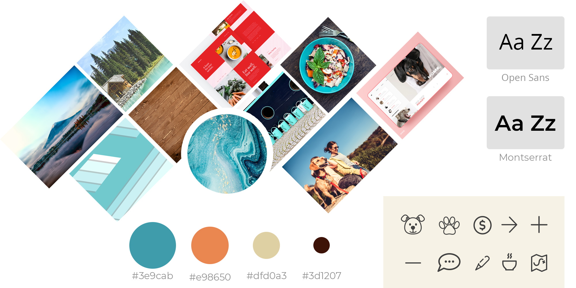


Moodboarding
A mood board was created to determine the right mood and emotions from the product. Friendly, peaceful and natural were the 3 main words used to describe the brand's philosophy.
Visual Hierarchy
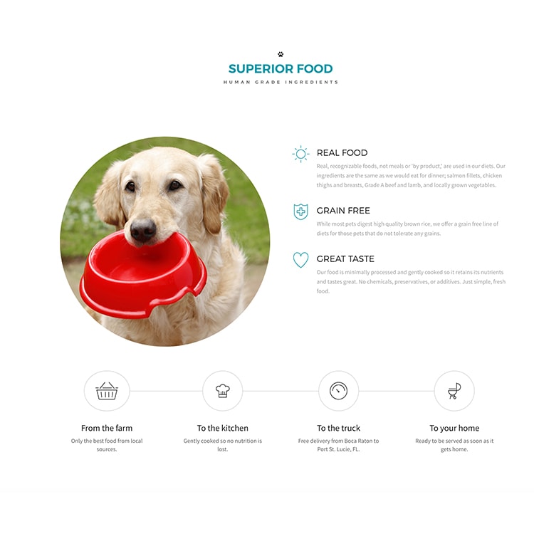
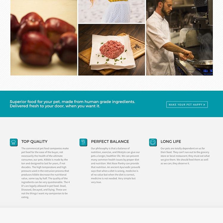
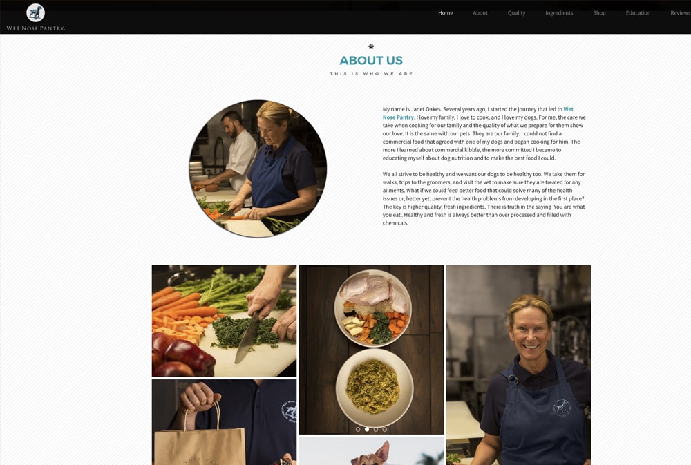
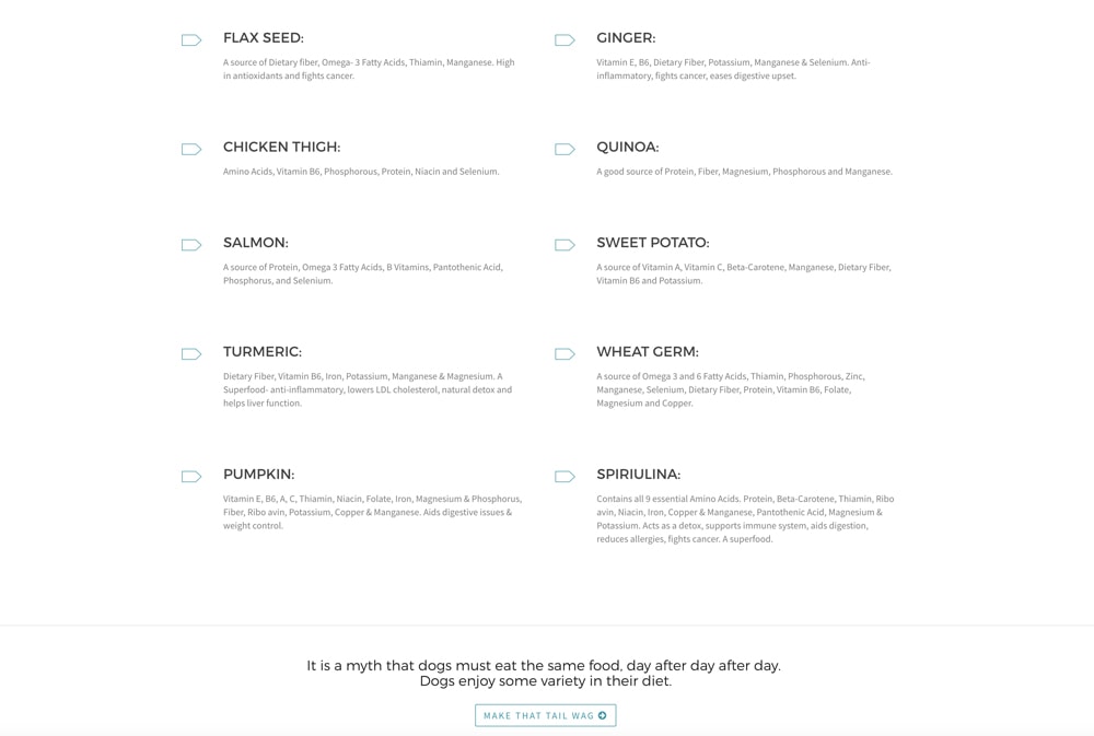
Since one of the user's main pain points was the poor connection with the brand due to the lack of ingredient images, I decided to center the visual hierarchy around this element.
Iconography
By creating signature moments with custom iconography and light animation, I ensure that the user has not only a great experience but also a low cognitive load.
THE
DRESSING
In order to get the most accurate feedback from the customers I wanted to perform usability testing with a small group of users. I built an interactive prototype with high fidelity wireframes so I could test the user flows and spot any potential usability issues, dark patterns or antipatterns. Here are a couple of samples from the interactive prototype:
Simplicity
By keeping every interaction contained within the parent screen and having the main menu available at all times, the user has the ability to explore any section at at any time.
Convenience
A heuristic evaluation was performed on the prototype prior to usability testing in order to determine how empathetic, consistent and flexible the experience was.
Speed
The user can post reviews, place new orders or simply contact support in very few steps. Every experience is self-contained but allows access to the rest of the options at all times.
THE
SITE
Just like the application, I designed the company's website to act as an extension of the brand. By using the same pattern library I ensure that the user not only has a great experience interacting with the product, but also promote consistency, customer loyalty and retention rates.
Here are some of the additional studies done for the website's design:
THE
PROCESS
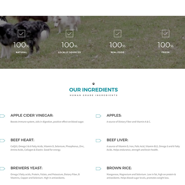
- 67% of the users expect a more detailed description of the ingredientsin the site.
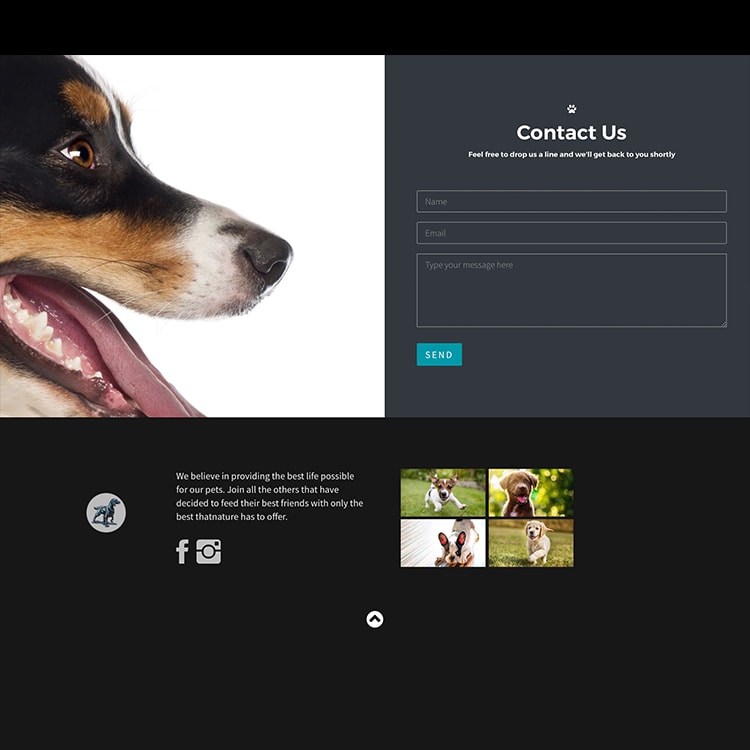
- 78% of the users would like to have some exposure to the brand's social media without having to leave the site.
- 65% of the customers expected an area that provided them with helpful tips regarding their pet's wellness.
- 49% of the users expressed that their interest on a brand that sells pet's products increased when exposed to videos of pets.
- Build different modules and sections that stayed consistent with the rest of the brand.
- Save time
- Create a scalable product.
- Maintain the iconography consistent while addressing the original pain points as well as the ones from additional research.
- Bootstrap
- HTML
- CSS
- JS
- Some light Jquery
- A little PHP

FINAL
RESULT
30 days after deployment a review of the site's performance was requested to the client. The company shared the following results:
The client base increased due to the image-centered visual hierarchy according to customer service feedback.
Product sales increased thanks to a smoother and more intuitive shopping experience and checkout process.
Multiple customers expressed that they enjoy learning about the company's story through the gallery, and information modules.
Both the Review and Social Media modules have been mentioned during trade shows.