Paramount Pictures
Film & Television Production Studio
THE CONTEXT :
Paramount Pictures is one of the top movie studios in the entertainment industry. As one of the biggest names in the film environment, Paramount develops and distributes films and television shows across the world.
The company requested a complete overhaul and redesign for their intranet system. Based on user feedback gathered by the stakeholders, the team was experiencing very low engagement rates and a difficulty to track, generate and locate documentation. Decreasing the amount of time to locate documents and promoting a sense of belonging within smaller teams were part of the most important requirements.
- ClientParamount Pictures
- IndustryFilm & Television
- My RoleLead Senior Product Designer ( UX & UI )
- Websitewww.paramountpictures.com
the challenges
- Redesign the product to increase document visibility through short and role-based user flows
- Consolidate document location within the platform to prevent confusing patterns
- Incorporate a status system for documents that require signatures or official approvals
- Build department-based environments within the platform to increase user connection and interaction
- Add information modules based on the user's most frequent searches. Ideally team and role-based
- Effectively apply branding to the entire platform to increase user interaction and expedite document-based flows
the strategy
- Conduct one on one interviews with the stakeholders and the team to define and confirm the biggest pain points related to the current intranet
- Perform a historical data analysis on the current system to spot the biggest usability issues
- Work on light competitive analysis to gauge which sections and functionality are being prioritized by the competitors in comparison to Paramount
- Collect and synthesize the data gathered through the existing heat mapping and user behavior tool
- Generate a user journey map based on the results from data synthesis and additional workshops like card-sorting
- Identify unique elements of each team to visually create team-based environments within the intranet
- Conduct usability tests to verify the efficieny of the design patterns and iterate as needed.
- the tools

MY
PROCESS
While the stakeholders' main goal was to have a product with high engagement rates, I still wanted to ensure that we stayed focused on optimizing the journey based on data acquired through workshops. This meant addressing the patterns observed and improving them according to existing mental models that wouldn't force the users to onboard again, thus creating additional pain points.
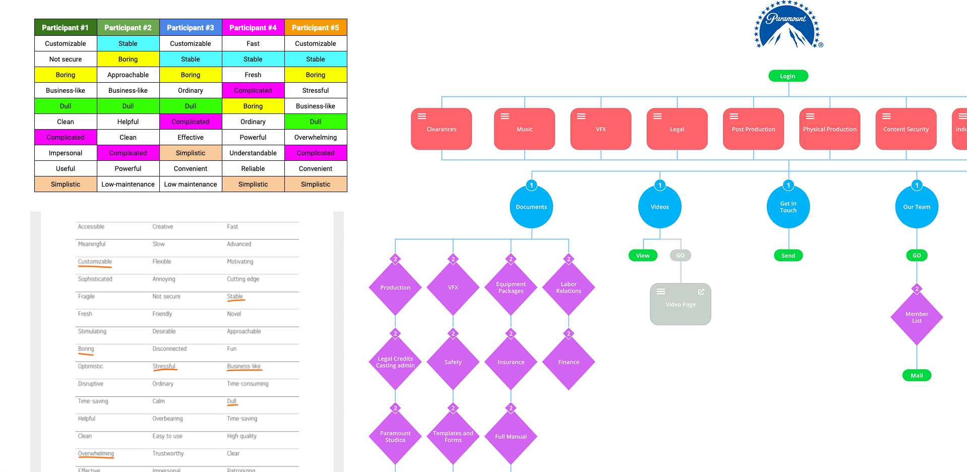
Once a new journey map was tested, I collected data through an adjective test to pinpoint how the users felt towards the original platform. I also leveraged branding to give each team and sub-team its own identity. This would generate a final product that wouldn't rely on heavy cognitive load, foreign mental models or deeply nested assets.
USER
RESEARCH
The entire thing feels like a cardboard box, it works but I wouldn’t rush to work to use it…
I can't ever point new employees to the right documentation because of how complicated the intranet is...
To be honest I don't really trust it and whenever I need a document I send a direct message to the legal department instead...
Beyond that, I wanted to get an accurate sense of how the main segment felt about the product; so a couple of surveys helped me add some valuable quantitative data and discover several things:
- More than 90% of the user base described a "frustrating" experience when interacting with the current platform
- The majority of manager-level employees showed "lack of trust" when trying to use the platform to source legal documents
- Version control for documents was discovered as an additional pain point since it had a direct impact on product trust and a sense of reliability
- Almost the entire segment described the current system as something that feels entirely as a separate product that is not part of the brand
- Close to 70% of the team could benefit from a personalized experience that displays documents and information only connected to their role and team
The following are some of the findings:
- Most participants used the words "boring" and "complicated" during the adjective test when describing the current platform
- The emotional response connected to the product during the interviews was of frustration
- The heuristic evaluation surfaced multiple redundant and overcomplicated flows such as finding third party contracts for production
- Regardless of the section that a user navigates to, there is no consistent pattern used for secondary navigations or the overall way to navigate through sections
- No error prevention was observed during the Heuristic evaluation when removing documents from specific sections
- The majority of the adjective participants described the current platform as "ordinary"
Some of the elements that we needed to keep in mind and include into the first prototype were:
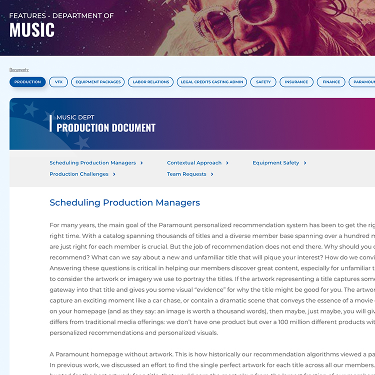
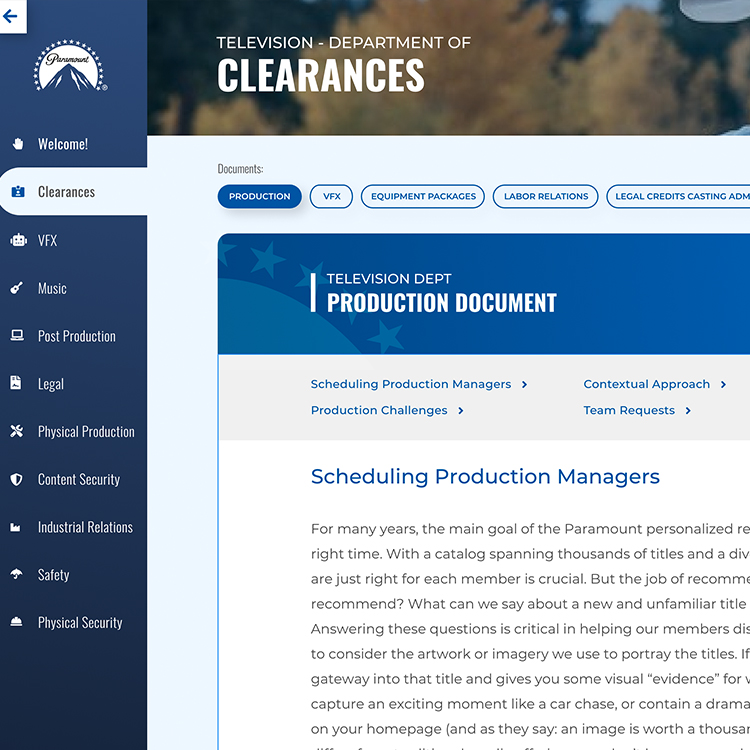
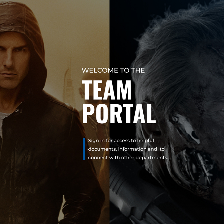
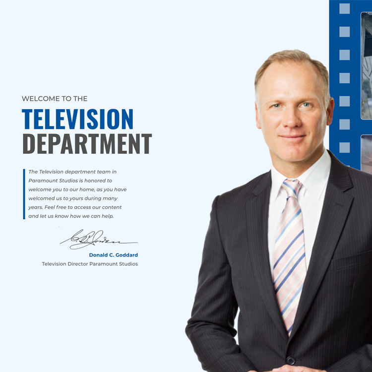
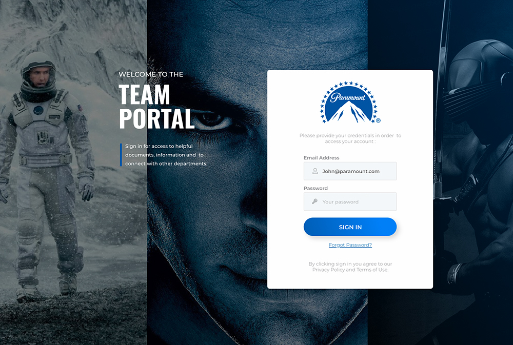
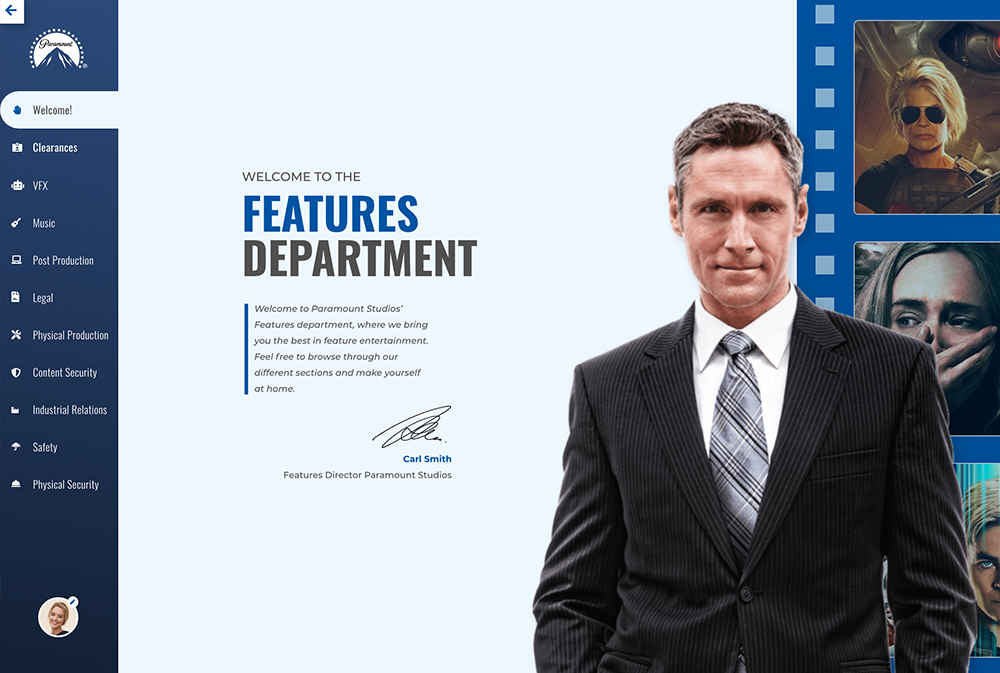
- A clear screen after login flow that communicates to the user the main departments so the experience stays tailored from the beginning
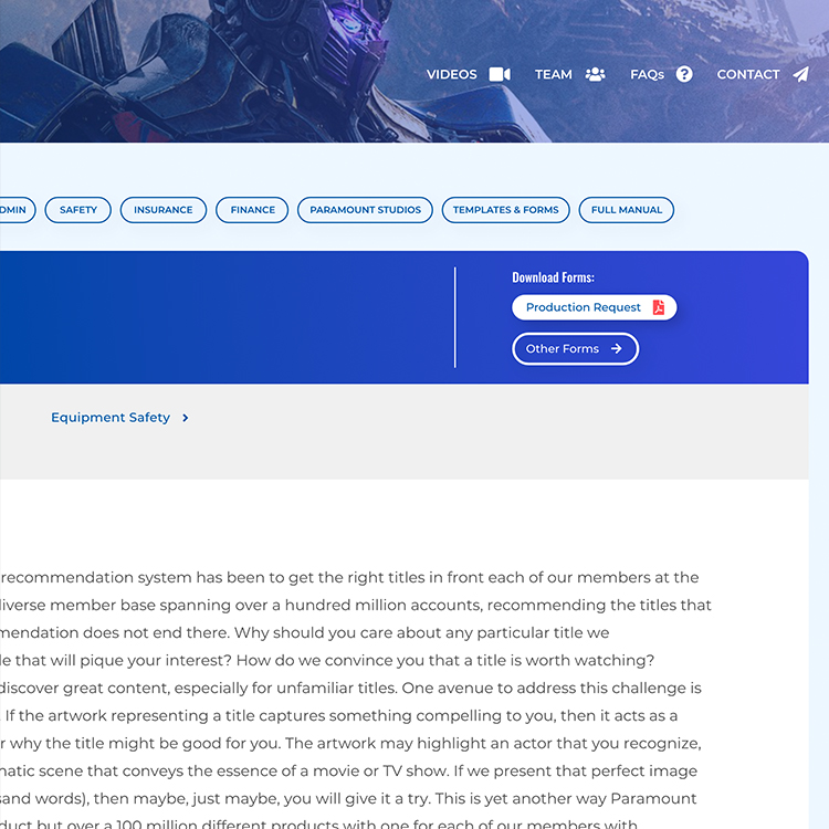
- A primary and secondary navigation that needs to stay visible for the user throughout the entire experience. This should mitigate any issues related to a role and team-based experience
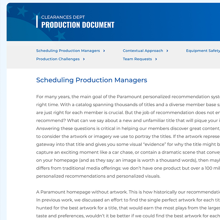
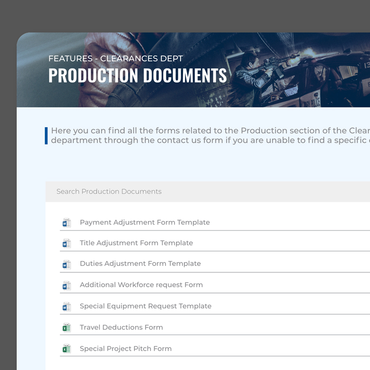
- A consistent way in which documentation is offered within each team sub-section so any user can understand the expectation with that flow
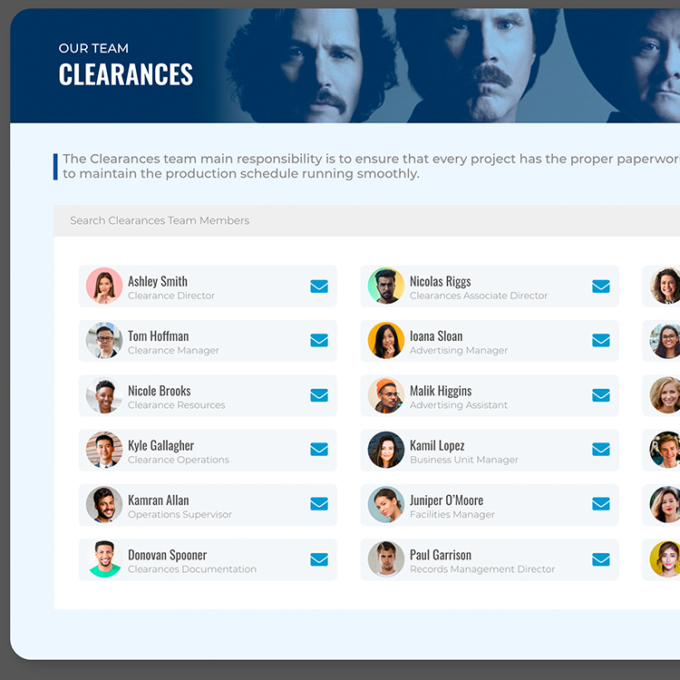
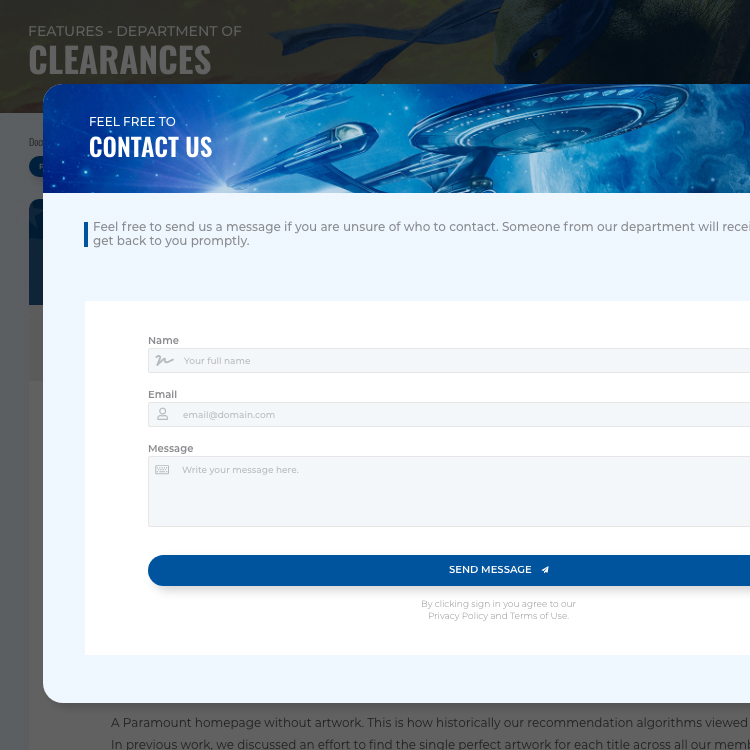
- A section that lists every team and allows the user to directly reach out to specific employees when needed
- A customized FAQ module for each department with information relevant to the corresponding roles

ITERATIVE
PROTOTYPING
As a result of the workshops we were able to:
- Ensure that the user had constant visibility for the navigational elements directly linked to their role and team
- Create a layout that anticipates substantial growth, specially since the product is an intranet that is likely to grow
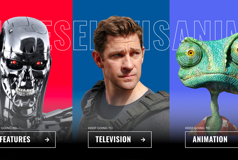
- Determine the best way to showcase the different departments and create a role-based funnel the moment the user logs in
- Successfully tested a significantly condensed flow that requires less clicks for the user to reach relevant documentation
- Confirmed the display order for the sections on the secondary navigation based on user engagement during the workshops
Some of the strategies applied were:
- Leaned on bold imagery from the studios’ properties to convey the different areas and teams of the intranet
- Applied a bright and colorful color palette that is consistent with the brand’s tone and style guidelines. Using blue as the primary color not only because it directly connects with the brand but also because of its perception of trust and communication on UX psychology
- Similar to color, I applied a bold approach to typography to stay consistent with the brand and keep promoting good readability
- Introduced scalable UI patterns like pagination for document display so we could mitigate any potential overwhelming experiences because of the amount of data shown
Some of the results of the tests were:
- We confirmed that the vast majority of the participants had a smooth and clear experience when interacting with the team funnel page
- The emotional response that all participants showed once the prototypes were displayed was of excitement. Several described a need to “explore more” just to see how specific areas of the product or sections were visually designed
- The majority of the participants described the experience as incredibly “memorable” and “fun” to interact with
- A very small portion of the participants had some difficulty when reading some subsections. This guided our decision to implement secondary UI patterns like iconography as support elements for some components. We also increased the font weight and contrast of the type to increase accessibility further
- The biggest pain point of heavily nested documentation was solved by consolidating the click-flow required. The majority of participants completed the assigned task of finding documents without effort

FINAL
RESULT
60 days after deployment a review of the product's performance was requested to the client. The company shared the following results:
The redesign of the intranet was well received by the team and increased user interaction within a few weeks from release. The scalable structure allowed new sections to be built seamlessly.
Due to the substantial simplification of the user flows to find and download documents, the userbase's response was incredibly positive. Onboarding flows for new employees received a particular good response.
Applying branding and sub-branding heavily throughout the platform proved very efficient in regards of user engagement. Feedback collected by human resources showed a much more positive connection with the intranet.
Collaboration within teams and cross-department, was heavily improved. The tailored experience based on teams and roles significantly increased team interaction and communication.