Technicolor
Entertainment & Creative Services
THE CONTEXT :
Technicolor is one of the world's top creative and technology leaders that provides services to the entertainment industry. This includes high quality of VFX, animation, media and advertising for a wide variety of projects around the globe including but not limited to movies, tv shows, etc.
The company requested an application that would serve as the one source for product management, organization and employee productivity. The main goal was to reduce the amount of third party tool interaction when working on any project within any team. An attention to expedited UX flows and an intuitive UI was required.
- ClientTechnicolor
- IndustryEntertainment
- My RoleLead Senior Product Designer ( UX & UI ) &
Front-End Developer - Websitewww.technicolor.com
the challenges
- Create a product that reduces the need to constantly log in to third party tools.
- Provide a dashboard that can easily integrate with multiple third party services.
- Build a platform that would learn the user's habits and categorize tickets according to interaction level.
- The final product should have an element of gamification to encourage productivity.
- Design the application anticipating heavy usage.
- Apply branding to promote brand empowerment and ownership within the team.
the strategy
- Conduct a competitor analysis in order to determine what makes a great productivity tool great.
- Perform a hybrid research study with both generative and evaluative workshops in order to understand the users' main value points.
- Determine what could be perceived as a negative trait when gamification is included.
- Ensure the development team is included early in the process, particularly once the top integrations are defined through research.
- Generate a series of UX flow maps to find out the best ways to optimize user interactions.
- Build interactive prototypes based on reusable and scalable UI patterns that rely on readability.
- Conduct usability tests to verify the efficieny of the design patterns and iterate as needed.
- the tools

MY
PROCESS
The process for this project required the leverage of a constant flow of gathered data in order to get stakeholder buy in and support each design decision.
Because of this and the strict timeline set by the client; I decided to move forward through quick sprints of hybrid research. The methdology I used was a hybrid survey containing both qual and quant based questions. One on one interviews were used as the first step but the rest of the process moved through the hybrid approach.
The snapshots below are part of some of the documentation collected during research and collaboration workshops.
USER
RESEARCH
I'm at the point where I dread starting each day because how many systems I have to log into...
I really think that a bit of extra recognition would go a long way for those weeks when we push the hardest...
As a manager, I find it very challenging to maintain transparency for the production of my team...
Due to the timeline requested by the stakeholders, we decided to conduct most of the research through small sprints and a hybrid approach. This allowed us to move faster and through a dual-track methodology.
As the first step, we decided to conduct one on one interviews so we could define the patterns before moving to the hybrid surveys. The following are some of the results:
- Most of the head stakeholders are heavily focused on team productivity
- The majority of the users spend an average of 60-90 minutes a day interacting with third party tools
- Almost all participants, including stakeholders have a negative view of productivity systems. They view them as "incomplete tools designed to only provide one point of value"
- Junior-mid roles, find the process of using multiple tools "intrusive and overwhelming"
- 90% of interviewed participants wish they could have a daily dashboard based on role priorities
This allowed us to find a series of patterns that helped us determine the priorities for the platform. At the same time, it helped us to get stakeholder buy-in and prevent making decisions based on unilateral views.
This process was repeated several times as we focused on different features. The following are some of the key findings that helped us determine the core features:
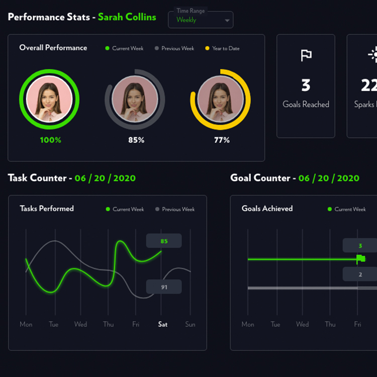
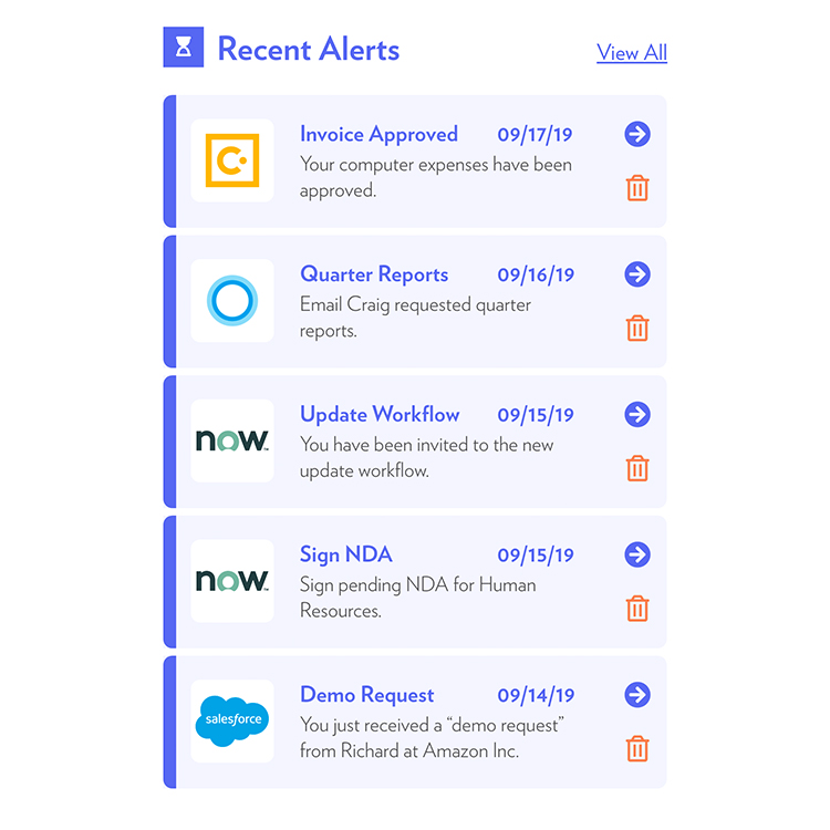
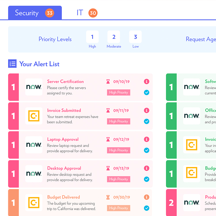
- The main segment would find it very useful if they could see their tasks divided by priority level regardless of the source platform
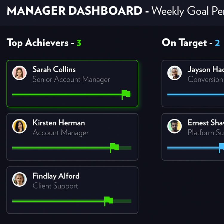
- Team leaders would benefit from having a view with detailed teammate performance
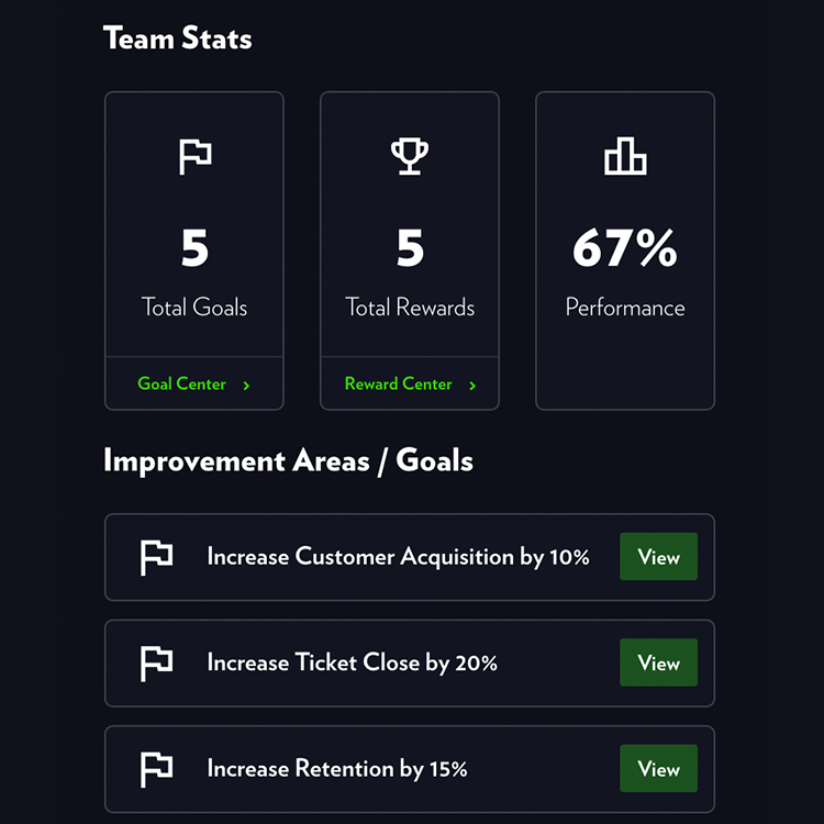
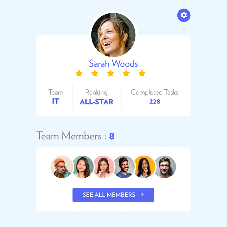
- A big part of the segment would like to see accountability added through specific components and workflows
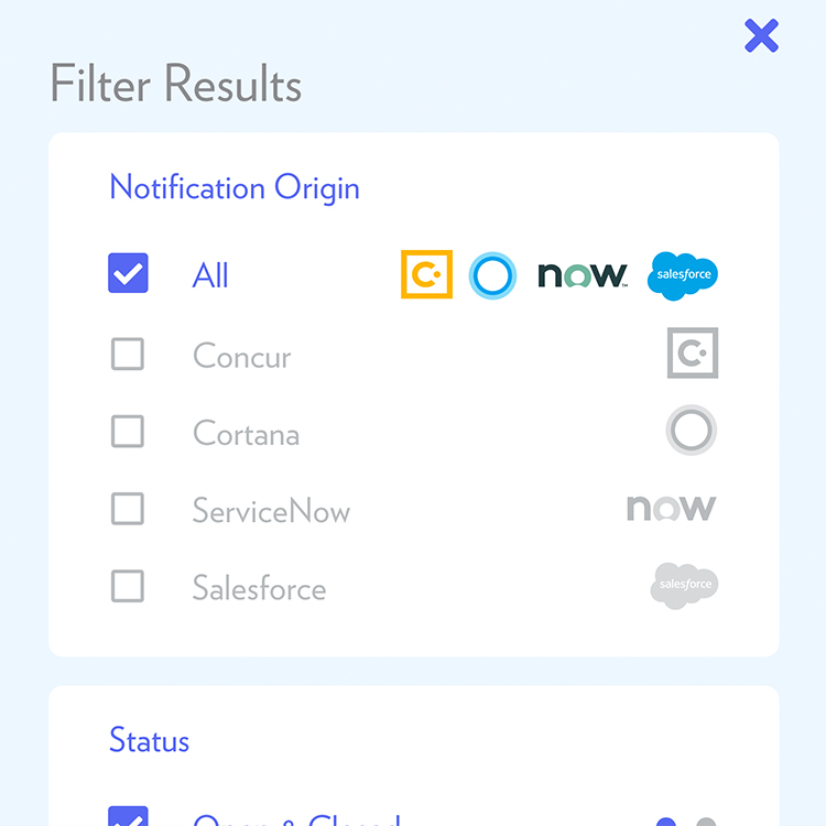
- Most of the customers would like to have the ability to customize which integrations are displayed first on the dashboard
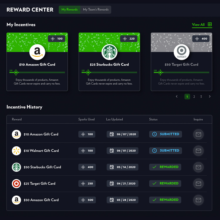
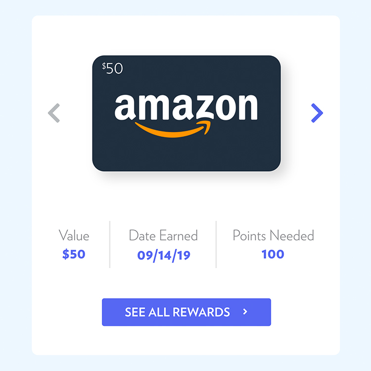
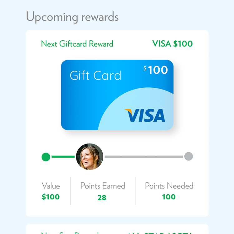
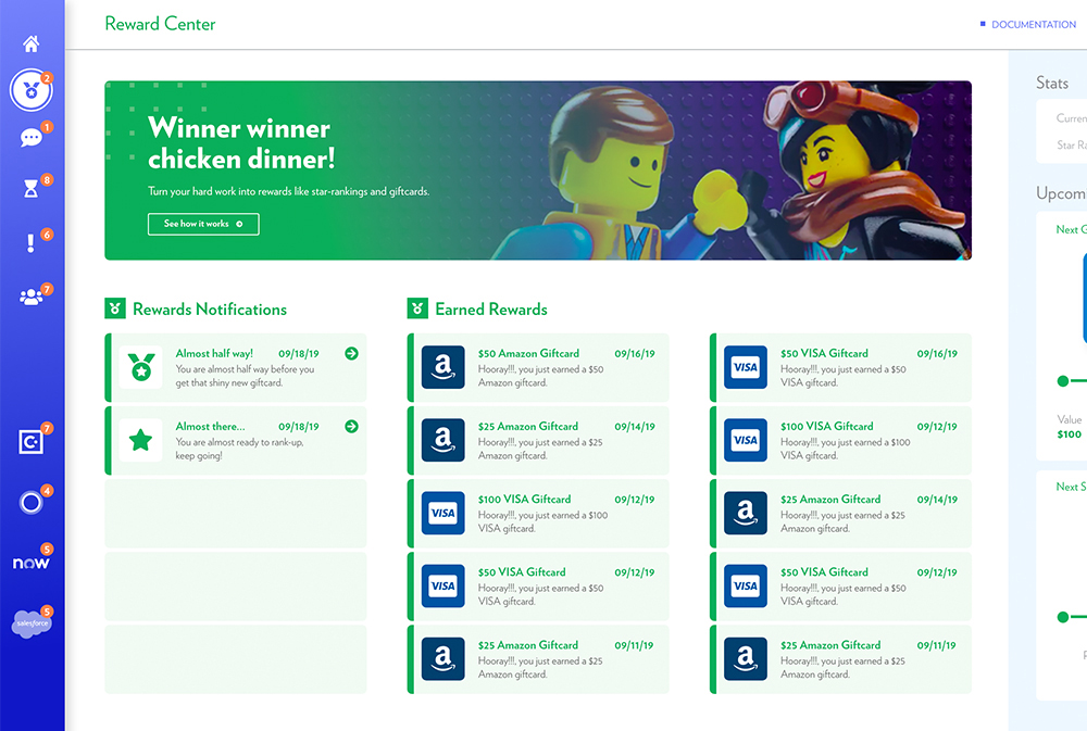
- About half of the userbase would feel motivated by seeing how close they are from a reward through a detailed "points" view
- The majority of the customers find extensive visual noise intimidating and overwhelming. The ability to customize the amount of information displayed would substantially help mitigate this issue
During the workshops, we discovered several areas for improvement and confirmed the following:
- The final product would have to leverage AI to learn user patterns and categorize priorities based on those
- We confirmed that engagement would be increased by allowing dashboard customization
- We discovered that promoting communication between teammates could encourage production further
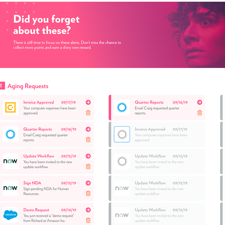
- We found that both priority levels and age of tasks need to be clearly differentiated to add more value
- Several user journeys could be simplfied and consolidated through modules within cards. This would allow for a more intuitive experience based on the participants' reactions during testing
ITERATIVE
PROTOTYPING
To do this we started with a simple series of impression workshops:
- We tested the participants' reaction particularly once the dashboard loaded. The adjetives that were most used were "peaceful, smooth and clear"
- Multiple users described their first impression as "inviting"
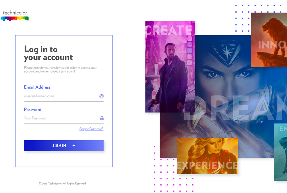
- Several color schemes were tested. A light version with the ability to change to dark gathered the best response with the users
- Incorporating imagery through hero-based modules mitigated the perception of chaotic visual noise
- There were several tests targeting the copy as well. A personalized approach received a very positive experience and was memorable when asking participants what was the first thing remembered once the dashboard loaded
They really helped us to consolidate user flows and optimize the experience for the customers. During the process, we were able to discover additional patterns that enhanced various flows substantially. Some of the results of the workshops were:
- The user easily identified the different sections through the imagery, iconography and colors used
- Implementing secondary and even tertiary UI patterns that supported each other allowed the experience to be very accessible and inclusive
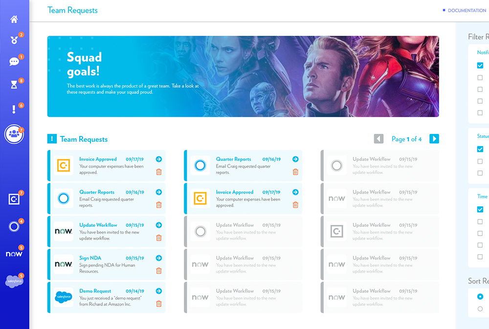
- A robust filtering system was implemented to allow the user further control over the displayed information
- We confirmed the need to add clear visual cues that communicated prority level and age of task separately
- Incorporating error prevention flows decreased the sense of fear and permanency that was perceived during testing on some participants
- The user flow to claim a reward was consolidated after noticing a pattern of frustration on the original version
Some of the enhancements added during this stage were focused on optimizing the UI to support the user journey:
- A retractable behavior was added to the side panel on the main dashboard to allow the user to decrease visual noise further when desired
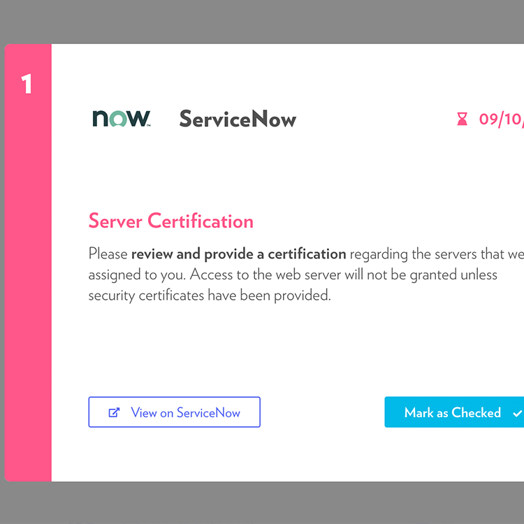
- A labeling system based on type, color and iconography was added to task cards to communicate urgency and priority simultaneously
- Micro-interactions for the management view were added to test visual hierarchy
- "Difficulty" labels were added after their inclusion proved valuable with a significant portion of the segment
- "Sparks" were added as the definition of points earned. This label tested more favorably for user engagement and product memorability

FINAL
RESULT
60 days after deployment a review of the product's performance was requested to the client. The company shared the following results:
Due to the core functionality that centralizes multiple external tools, the time required to address a diverse group of tasks was substantially reduced to 30 min in average.
The ability to see the most important tasks based on user role on load had a positive impact on productivity. The majority of customers described the experience as "expedited and clean"
The personalized approach to text and high customization to decrease visual noise, increased engagement throughout the company. Direct engagement with third party tools dropped.
From the tested color scheme to the reward center, the userbase defined the experience as "very memorable" and quickly adopted it as the default tool for multiple workflows.